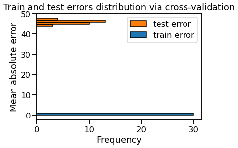
I agree that kind of representation is not common.
But I think it s counterintuitive to read the result on x axis if you keep histograms as you choose to draw.
Since you are not using at all the ‘frequency’ values in your conclusions why go for a histogram?
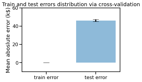
You could obtain a better visualisation of the difference between train and test errors in drawing a box plot or a bar plot:
import matplotlib.pyplot as plt
scores.plot.box()
plt.ylabel("Mean absolute error k$")
_ = plt.title("Train and test errors distribution via cross-validation")

train_error_mean = scores['train error'].mean()
test_error_mean = scores['test error'].mean()
train_error_std = scores['train error'].std()
test_error_std = scores['test error'].std()
x_labels = list(scores.columns)
x_pos = np.arange(len(x_labels))
CTEs = [train_error_mean, test_error_mean]
stds = [train_error_std, test_error_std]
fig, ax = plt.subplots()
ax.bar(x_pos, CTEs, yerr=stds, align='center', alpha=0.5, ecolor='black', capsize=10)
ax.set_ylabel('Mean aboslute error (k$)')
ax.set_xticks(x_pos)
ax.set_xticklabels(x_labels)
ax.set_title("Train and test errors distribution via cross-validation")

plt.ylim(ymin = -10, ymax = 60)
plt.show()
I remember that when i was still a student (a long time ago) the director of my lab was used to say that a figure should give all the informations needed without to have to read the commentaries below. When I saw your figures, before reading the conclusions i thought frequencies of the 2 distributions were important somehow since they were the values on y axis, the axis where you normaly the important results ;).