Last question of the wrap up quiz

I’m confused with the answers to the last question.

Here is what I get from my code, which is basically the same as with the provided answer.

t%C3%A9l%C3%A9chargement

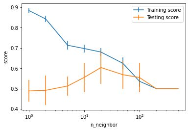
Now from what I understand, the training score is very high between 1 and 10 neighbors, while the test score is low. It means that my model is overfitting the training set, but does not perform well on the test set, am I right ? If so I don’t understand the answers to the test which say the opposite. The same goes when using a large number of neighbors. For me both scores are low, so we are underfitting. Then between 10 and 100 we have an in-between situation.

Could you clarify it for me please ? And if I’m confused, probably others will be.

Wether I’m right or wrong, I think there should be a self-explanatory figure in the answer of the last question, showing why and where it is overfitting or underfitting. This would remove any ambiguity.

Thanks it seems indeed that the answers were wrong.

- a) The model underfits for a range of `n_neighbors` values between 1 to 10
- b) The model underfits for a range of `n_neighbors` values between 10 to 100
- c) The model underfits for a range of `n_neighbors` values between 100 to 500
- d) The model overfits for a range of `n_neighbors` values between 1 to 10
- e) The model overfits for a range of `n_neighbors` values between 10 to 100
- f) The model overfits for a range of `n_neighbors` values between 100 to 500
- g) The model best generalizes for a range of `n_neighbors` values between 1 to 10
- h) The model best generalizes for a range of `n_neighbors` values between 10 to 100
- j) The model best generalizes for a range of `n_neighbors` values between 100 to 500

the right solution: c) d) h)

our solution which was wrong: c) h) j)

Let me know if this does not match your expectations …

About providing the plot yeah it would be nice I agree but I don’t know how to do it in a nice way with our current setup. Needs to think a bit more about it.

I guess we provide the code in the solution so you can copy and paste it and execute in the notebook alongside the wrap-up quizz which I think is OK enough (although not great I agree …).

I fixed this in our repo but this will need to be fixed in FUN as well.

I also fixed the explanation in the solution which was a bit wrong/misleading.

The problem with the current solution is that it gives you the code to make the plot, but not the explanations to understand the plot. You could upload in the solution a figure with arrows and circles to highlight underfitting, overfitting and generalization zones.

This is what I picked, glad to see I was right on this one :smiley:

ok, it’s fixed in FUN

I am going to mark this one as solved and open a separate topic for the question of having plots inside quizz solution.

New topic about improving the user experience when navigating between notebook and quiz solution is here: Consider having plots as part of the quizz solutions