Heatmaps for multiple parameters

Hi,

the notebook Hyperparameter tuning by randomized-search notes that:

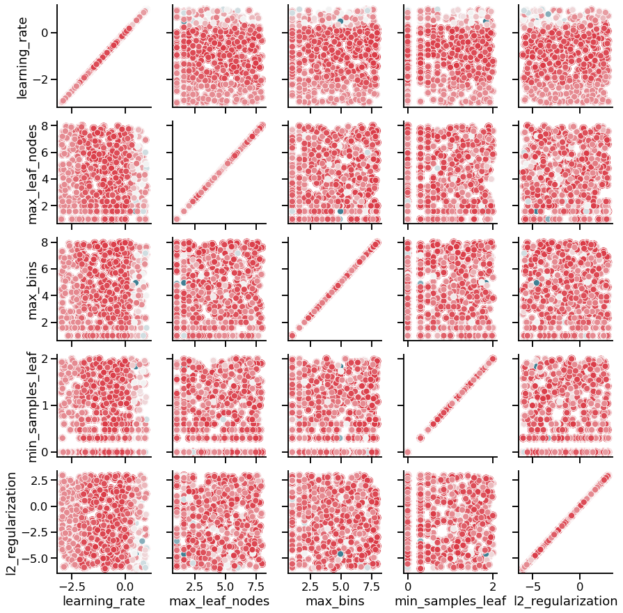
As we have more than 2 paramters in our grid-search, we cannot visualize the results using a heatmap. However, we can us a parallel coordinates plot.

This is true, however, at least for me, the pcplot doesn’t give a clear intuition of the tradeoff among different hyperparameters. If one looks at the range of hyperparameters which result in a mean_test_score of more than, say, 0.85, they seem to be all over the place (except for maybe max_bins which to seems to be restricted to high values, >7 after the np.log2 transformation). I guess the reason is the same why there wasn’t a single pair of best hyperparameters in Hyperparameter tuning by grid-search: we can have more or less the same fit by decreasing the values of certain hyperparameters and increasing the values of some other ones. I think this kind of tradeoff between hyperparameters would be easier to see from pairwise heatmaps, similar to the seaborn.pairplot used in Module 1 but for heatmaps. Is there a way to generate a matrix of heatmaps using matplotlib or seaborn? Thanks!

1 Like

I’m not sure that’s actually more readable than the parallel coordinates plot, but you could try something like:

import seaborn

results = cv_results.rename(shorten_param, axis=1).apply({
        "learning_rate": np.log10,
        "max_leaf_nodes": np.log2,
        "max_bins": np.log2,
        "min_samples_leaf": np.log10,
        "l2_regularization": np.log10,
        "mean_test_score": lambda x: x})

columns = ("learning_rate",
           "max_leaf_nodes",
           "max_bins",
           "min_samples_leaf",
           "l2_regularization")

palette = seaborn.diverging_palette(220, 10, sep=50, as_cmap=True)

pg = seaborn.PairGrid(results, vars=columns)

def scatter(x, y, **kwargs):
    seaborn.scatterplot(data=results, x=x.name, y=y.name,
                        hue="mean_test_score",  legend=False,
                        palette=palette)
    
ax = pg.map(scatter)

It’s a scatterplot rather than a heatmap, though. You could do the same with a heatmap but it would probably require a bit more preprocessing since I guess that you would have to bin the values first.

1 Like

You’re right: it’s no more readable than the pcplot, indeed. At most, one can get the hunch that intermediate learning rates lead to the best results (the hue seems to get lighter for extreme learning rates) but other than that, there doesn’t seem to be any correlation about pairs of hyperparameters and the mean_test_score.

1 Like

Agreed that parallel coordinate plots are not always easy to interpret at first and sometimes do not provide a clear answer. However, this is the only type of plot that I am aware of for this type of analysis. The tricky part is that we sometimes need a lot of iteration of the search to see some patterns.

If you are interested, there is a bit more content regarding this type of plot there: HiPlot: High-dimensional interactive plots made easy

1 Like