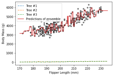
Could you explain why even though I have used the same code as in the solution, the predicted values from the individual trees are all very low and visualized by the lines at the bottom of the graph. Thanks!
forest = RandomForestClassifier(n_estimators=3)
forest.fit(data_train, target_train)

new_data = pd.DataFrame(np.linspace(170,235, num=300), columns=data.columns)

tree_predictions = []
for idx, tree in enumerate(forest.estimators_):
    tree_prediction = tree.predict(new_data.to_numpy())
    tree_predictions.append(tree_prediction)
    plt.plot(new_data, tree_prediction, linestyle='--', alpha=0.8, label=f"Tree #{idx+1}")

sns.scatterplot(data=penguins, x=feature_name, y=target_name, alpha=0.5, color="black")
forest_predictions = forest.predict(new_data)
plt.plot(new_data, forest_predictions, color="tab:red", label="Predictions of ensemble")
_ = plt.legend()